How to Analyse Stock Charts
8 minutes for reading
In this article, we will tell you how to read stock charts, what parameters are included in the stock price, and how stock candlesticks and bars are drawn. We will also evaluate the importance of factors for choosing promising securities, and demonstrate the main graphic patterns.
Drawing stock charts
The main instrument of a trader is a chart; it is where price analysis begins. The success of trading decisions depends on how skilled an investor is in analysing the stock market.
There are several types of charts: linear charts, bar charts, and Japanese candlesticks. They differ visually but are most often drawn by the same parameters. In most cases, these are the opening and closing prices, as well as the highs and lows over a certain timeframe.
Linear chart
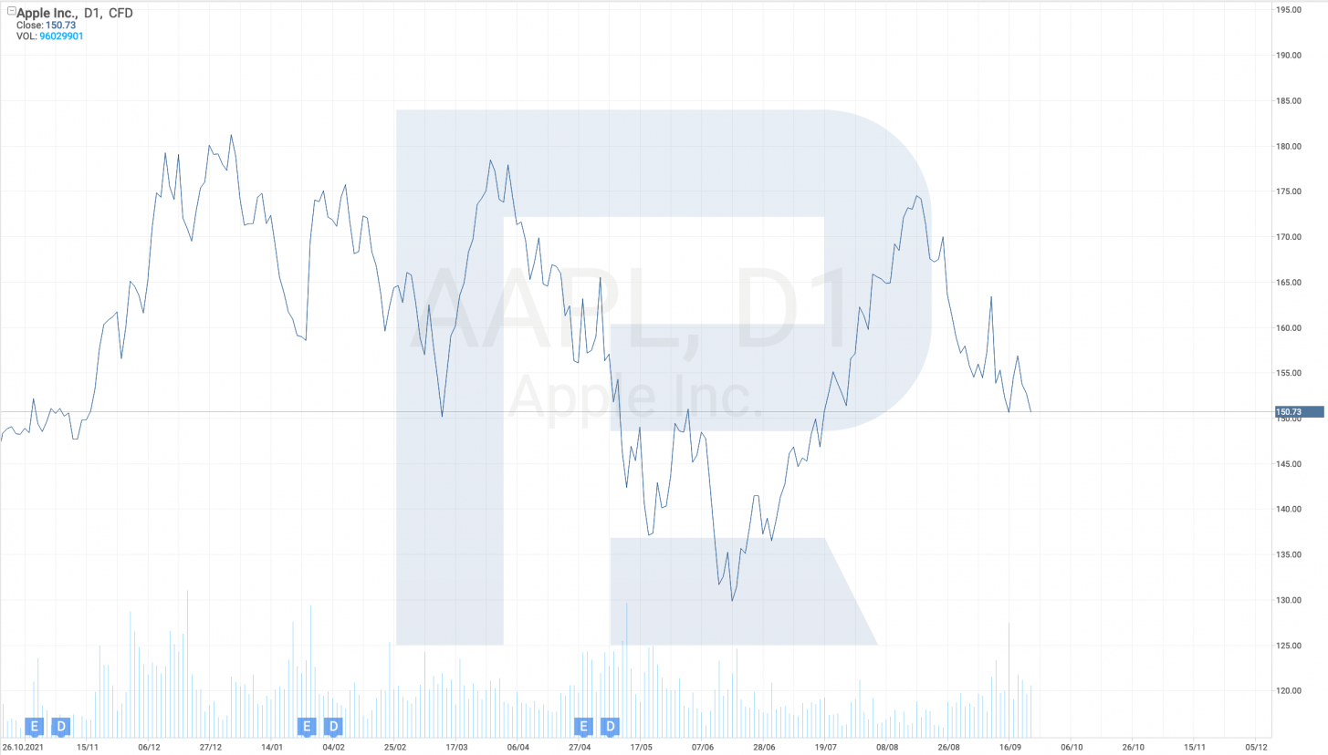
This is the simplest format of a stock chart; it is drawn by just the closing prices. For example, if a D1 timeframe is used, then the system automatically takes the price at the end of every day and adds it to the chart. Linear charts are hardly considered informative; therefore, traders rarely use them.
Bar chart
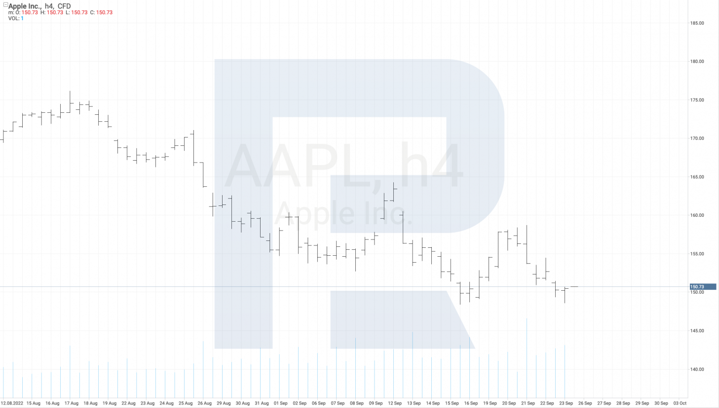
Stock bar charts provide traders with more information. The vertical line shows the highs and lows of a certain timeframe; the adjacent horizontal line on the left demonstrates the opening price, while the one to the right indicates the closing price. These basics give the clue to reading stock bar charts.
Japanese candlesticks
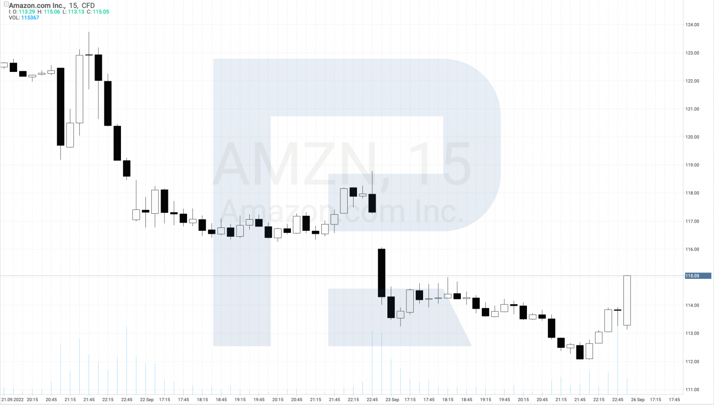
This is one of the most popular stock market charts these days. Price movements look like a rectangle, black or white. Traders call these rectangles candlesticks. Let's look into the details of reading stock candlesticks.
A white rectangle means that the stock is growing over the chosen timeframe, i.e. the closing price is higher than the opening price. The black rectangle means that the stock is falling over the chosen timeframe, i.e. the closing price is lower than the opening price.
Vertical lines above and below the candlestick are called shadows and show the highs and lows over the chosen timeframe. Japanese candlestick combinations prompt traders to depict probable price movements to follow.
Basic stock chart terms to know
- The opening price is the very first price with which the trading day begins; the closing price is the last price of the trading day. The previous closing price is one of the previous days
- The high represents the highest price of the timeframe and the low is the lowest price
- Market capitalisation is the total price of all the company stocks calculated as the total number of securities in turnover multiplied by the current stock price. The higher the capitalisation, the more a company is valued in the market and the better its prospects
- The P/E multiplier is the stock price of a company divided by a certain timeframe, such as the last 12 months. The multiplier helps the trader to find the fair stock price
- The dividend yield demonstrates how much the investor can earn annually from dividends. It is expressed in percent of the current stock price
- The 52-week high is, obviously, the high of the last 52 weeks. Conversely, a 52-week low is the lowest price within the same timeframe. These two prices are for the trader to compare to the current stock price for the purpose of determining how much room the stock price has for movements
Importance of volumes
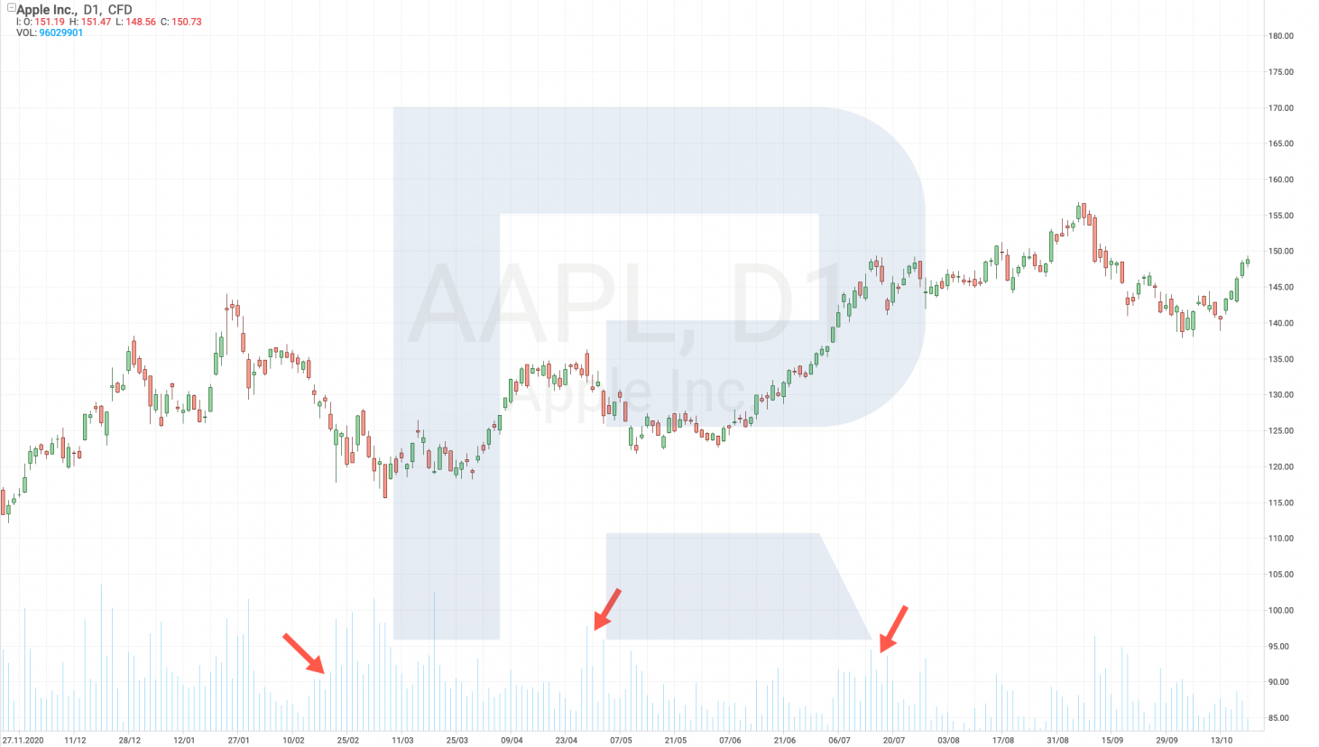
Volume is the total number of stocks bought or sold over a certain timeframe, such as a day. This index always attracts attention because high volumes demonstrate increased interest of market players in the stock.
Moreover, by the Dow Theory, volume must grow when the stock price is rising – and must fall when the stock price is falling. This index somewhat confirms the real stock price activity in market analysis.
Importance of the 200-day Moving Average
The Moving Average is one of the best indicators for defining the trend, so it attracts a lot of attention. The indicator with period 200 is a line based on the average price of the last 200 days. If the price is above the MA-200 line, the trend is bullish; hence, the stocks might go up.
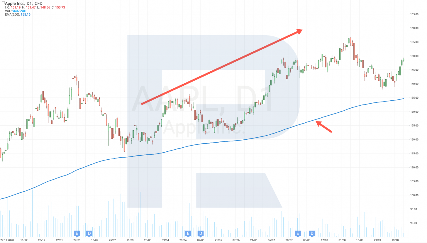
And if the price has broken through the 200-day MA from above, this means a reversal to a downtrend, so the stock price will most likely keep on falling until it rises over the MA-200 line again. Quite often, the price pushes off the 200-day MA upon testing the line, and traders interpret this as a signal for taking action.
Finding support/resistance levels
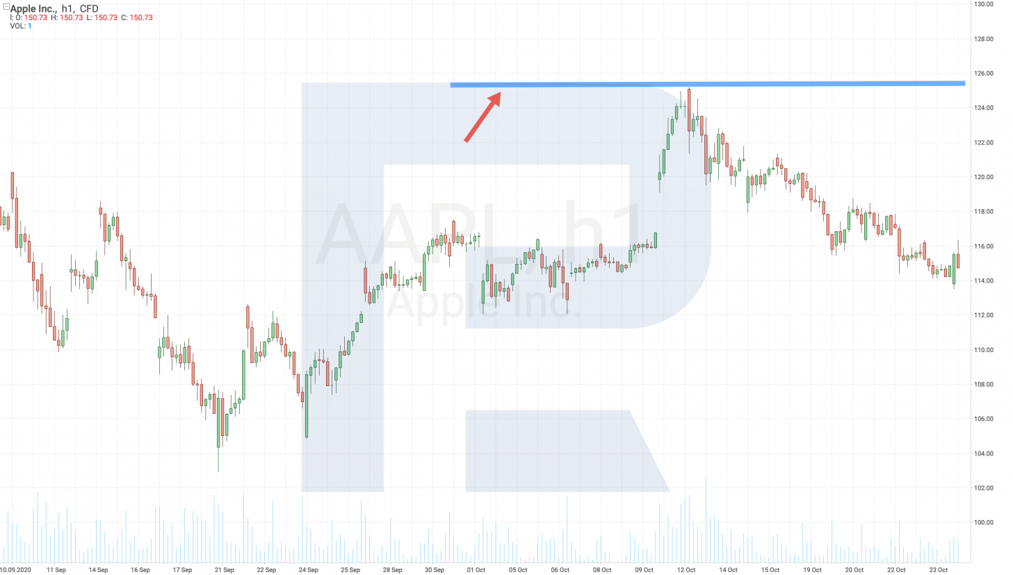
Resistance and support are the basic terms for reading stock market charts. The resistance line goes above the current price, thereby demonstrating the power of sellers. This is the level at which there are more sellers than buyers. Upon testing this level, the price pushes it and declines.
Support is under the current price chart, indicating the area where buyers are stronger than sellers. When the price drops to the support level, it bounces off it upwards.
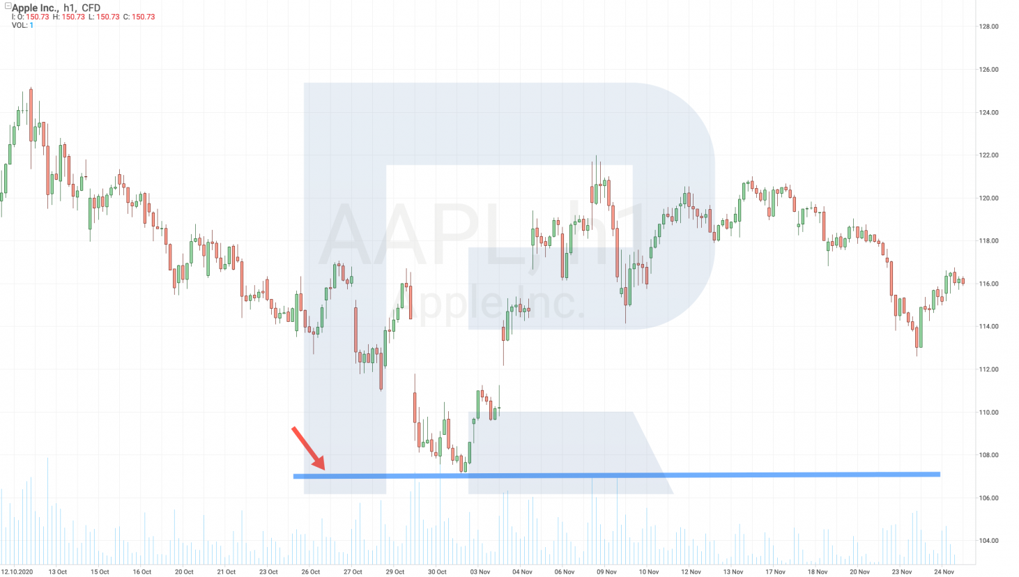
These levels interchange alongside price movements. For example, when the price breaks through the resistance level, the latter becomes the support for buyers. And when the price breaks through the support level, the latter becomes the resistance.
Understanding support/resistance levels helps to analyse stock market trends and trade with the trend. If the trend is ascending, experienced investors advise using breakaways of the resistance level or bouncing off the support. And in a downtrend, it is vice versa: try using breakaways of the support and bouncing off the resistance level.
What are the basic graphic patterns?
A graphic pattern is a repeated price structure on the chart that helps to forecast further price movements by its inner rules.
Experienced investors state that the basic chart patterns existed in the stock market in the past, and they are still working now and are expected to remain active in the future because they are based on the stock market participants' behaviour.
The three most widespread graphic patterns are the Triangle, the Flag, and Head and Shoulders. Let's discuss these and find out how to read them.
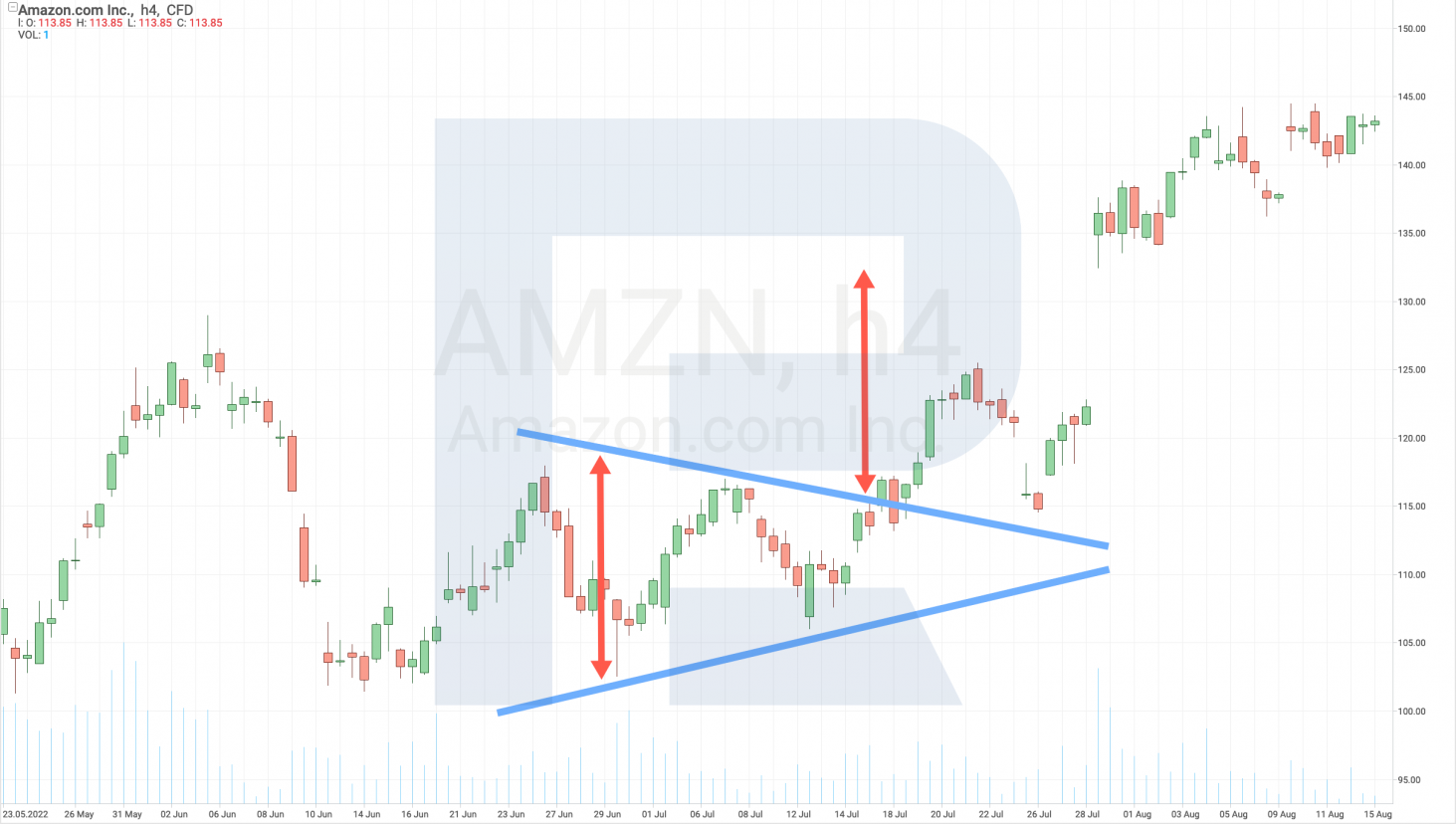
Triangle pattern
With four points and two lines drawn through them, the triangle represents a pause in the current movement. As a rule, the upper border is aimed down while the lower one is heading up.
Investors wait for one of the borders to be broken away and look for the next goal of the movement at the height of the pattern. It can be said that the Triangle represents a decline in volatility, which is then followed by a surge in activity.
Flag pattern
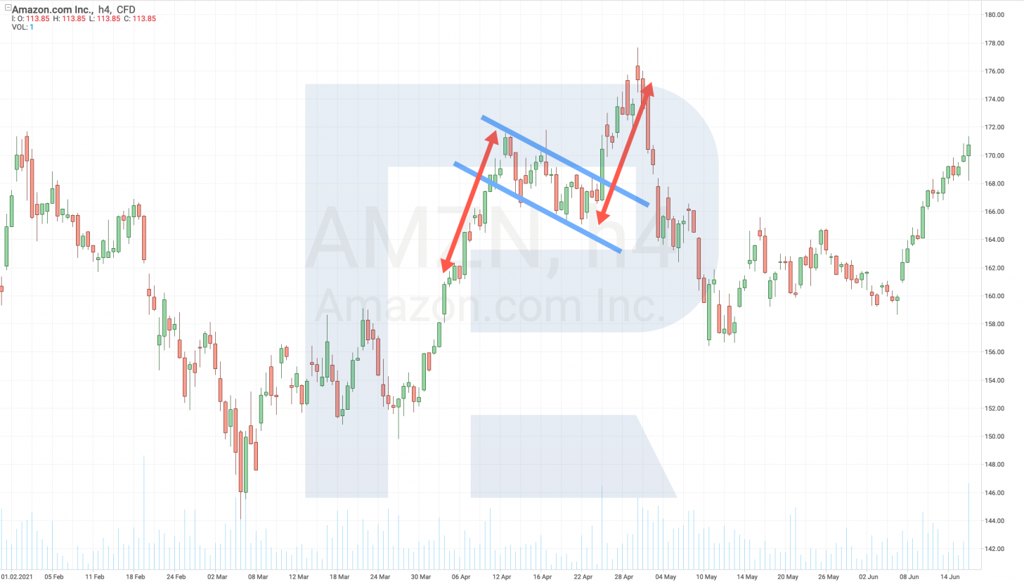
It is characterised by a strong movement and a minor sideways fluctuation against the main impulse. For example, if the main movement is up, the sideways one will be down. An investor waits for this channel to be broken away upwards, and looks for the goal of the pattern at the height of the previous movement marked from the breakaway point. The Flag is considered an aggressive trend continuation pattern, as market movements inside it are strong and fast.
Head and Shoulders pattern
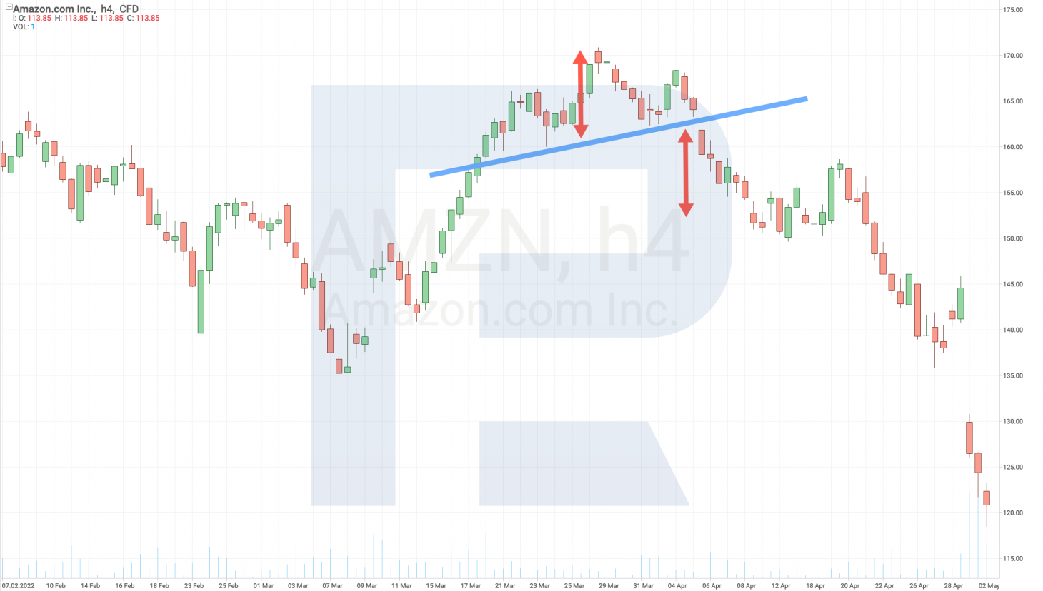
It consists of three peaks, the middle one being higher or lower than the other two. The middle peak is called the head, and the other two are the shoulders. Investors draw a line through the lows of these two peaks, calling it the neck. This is a trend reversal pattern: when the price breaks through the above-mentioned line, the price goes in the direction of the breakaway for the height of the pattern.
Note that the potential of the pattern can be assessed already at the moment when it forms: investors understand where the price will go in the nearest future when it is just fluctuating on a shoulder. The Head and Shoulders pattern is one of the strongest reversal patterns on stock market charts.
Closing thoughts
To read stock charts correctly, investors need to have knowledge, skills, and experience. In the article, we described the main chart types and gave their drawing principles alongside the basic terms. Also, we explained the importance of the 200-day Moving Average and trade volumes.
We shared with you some useful information about setting the support/resistance levels on the chart. We also listed some basic graphic patterns alongside their main peculiarities and characteristics.
* – Past performance is not a reliable indicator of future results or future performance.






 are complex instruments and come with a high
  of losing
  rapidly due to
  . 65.68% of retail investor accounts lose
  when trading
  with this provider. You should consider whether you understand how CFDs work and whether you can afford to take the high